Line Graphs with R and SPSS
Introduction
R and RStudio are two great tools for creating graphs. Although I think SPSS scores high on the graph creation category, it has several limitations. Arguably, its main shortcoming has to do with the lack of flexibility. This is not the case with R and RStudio.
Below, I will show how to create beautiful graphs with R and RStudio.
I will get started with line graphs.
Single line graph with R
To follow along, open RStudio, then create a new R script1. Then, copy and paste each chunk of code into the newly created script.
Finally, run separately each step (chunk of code) to create a Single line graph. We will start with Step 1, then run Step 2 to create the graph shown in Figure 1. Notice that this graph does not have the lines (or titles), yet.
Step 1
# Step 1: Create two variables (x, y) and assign numbers to each
x <- c(1:5)
y <- c(12,18,22,20,28)
Step 2
# Step 2: Create a Single plot
plot(x, y)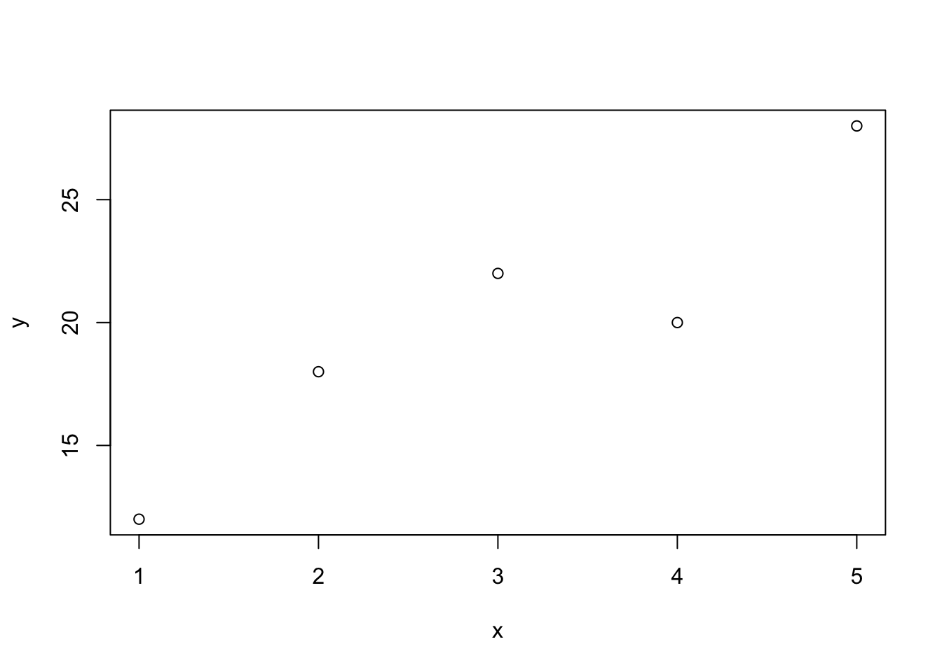
Figure 1: Single graph line without title nor lines
Step 3
# Step 3: Let's add labels for x and y and a title for the plot
plot(x, y, xlab = "x var title", ylab = "y var title", main = "Title")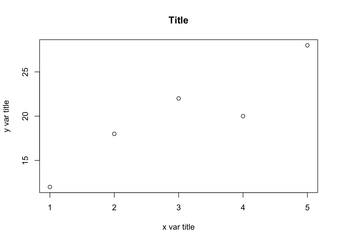
Figure 2: Single graph with titles but no lines
Step 4
# Step 4: Let's draw a line
plot(x, y, xlab = "x var title", ylab = "y var title", main = "Title",
     type = "o")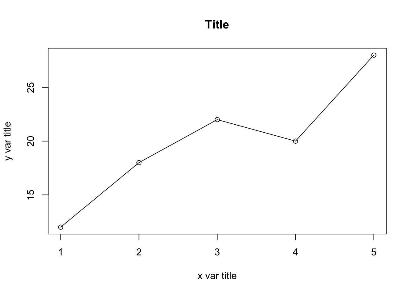
Figure 3: Single graph line with titles and lines
Step 5
# Step 5: Let's change the density and color of the line and dots
plot(x, y, xlab = "x var title", ylab = "y var title", main = "Title",
     type = "o", pch = 20, lwd = 2, col = "blue")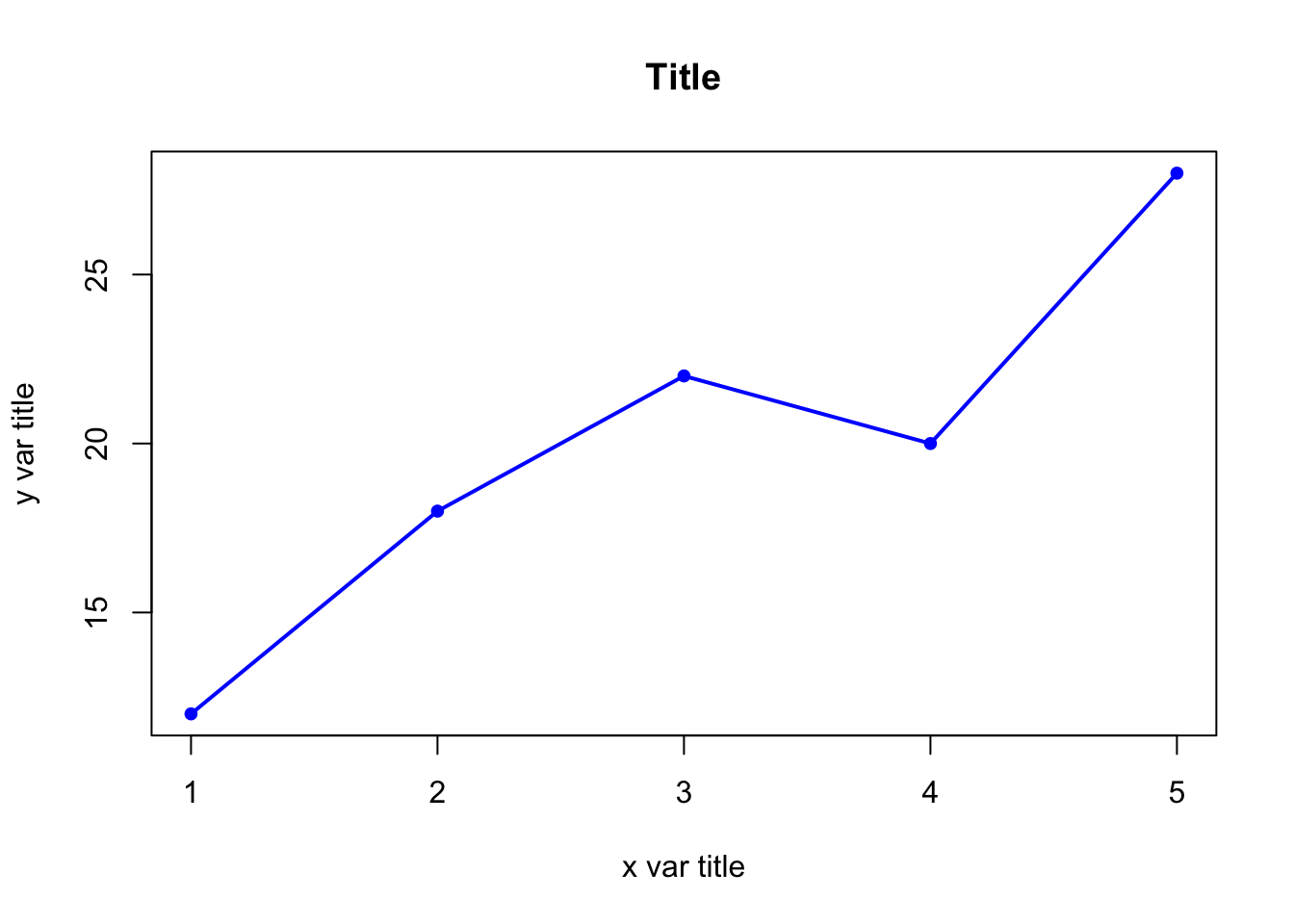
Figure 4: Single graph line with titles, different line density, and color
Multiple lines graph with R
The R script below was adapted from: http://bit.ly/34fDitr
To accomplish this task, you will need to use three other functions in R: points() and lines()
What you need to know
Three groups were tested 5 times (once every week for a period of 5 weeks) on BMI (body mass index). For a period of five weeks, two groups engaged in a physical fitness program whereas G1 did not exercise at all. Using this information, plot BMI changes over time for the three groups.
Group 1 (G1) = No exercise (control group)
Group 2 (G2) = Traditional fitness program
Group 3 (G3) = New fitness program
Step 1
# define 3 data sets
time <- c(1,2,3,4,5) # or simply c(1:5)
y1 <- c(24,24,26,23,25)      # Group 1
y2 <- c(28, 25, 26, 25, 24)  # Group 2
y3 <- c(30,30, 28, 26, 25)   # Group 3
Step 2
# plot the first curve by calling plot() function
# First curve is plotted
plot(time, y1, type="o", col="blue", pch="o", lty=1, ylim=c(0,50))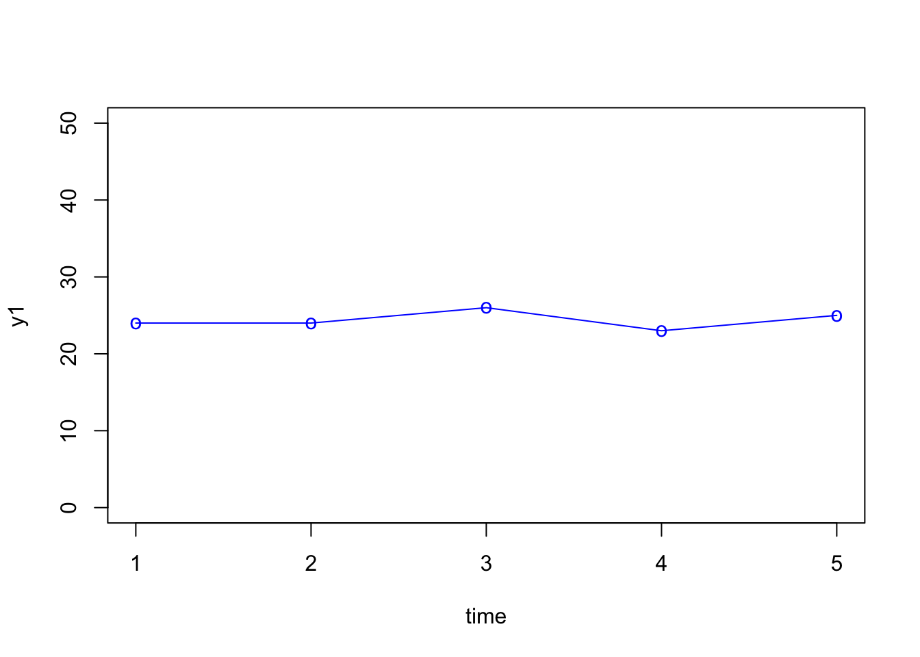
Figure 5: Multi line graph - first line
Step 3
# Add second curve to the same plot by calling points() and lines()
# Use symbol '*' for points.
plot(time, y1, type="o", col="blue", pch="o", lty=1, ylim=c(0,50))
points(time, y2, col="red", pch='*')
lines(time, y2, col="red",lty=2)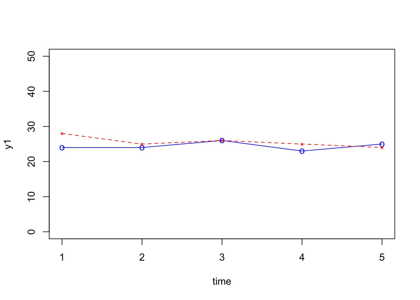
Figure 6: Multi line graph - second line added
Step 4
# Add Third curve to the same plot by calling points() and lines()
# Use symbol '+' for points.
plot(time, y1, type="o", col="blue", pch="o", lty=1, ylim=c(0,50))
points(time, y2, col="red", pch='*')
lines(time, y2, col="red",lty=2)
points(time, y3, col="dark red",pch="+")
lines(time, y3, col="dark red", lty=3)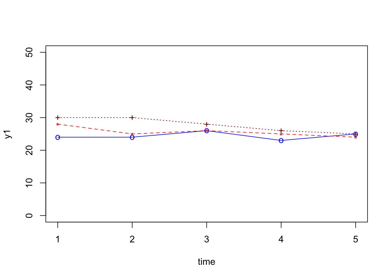
Figure 7: Multi line graph - third line added
ylim argument to 20, 35. This will improve the look of the plot. (2) In addition, add labels to y and x and a main title to the plot. Refer to Figure 2 for more details.
Step 5
# Add Third curve to the same plot by calling points() and lines()
# Use symbol '+' for points.
plot(time, y1, xlab = "x var title", ylab = "y var title", main = "Title", type="o", col="blue", pch="o", lty=1, ylim=c(20,35))
points(time, y2, col="red", pch='*')
lines(time, y2, col="red",lty=2)
points(time, y3, col="dark red",pch="+")
lines(time, y3, col="dark red", lty=3)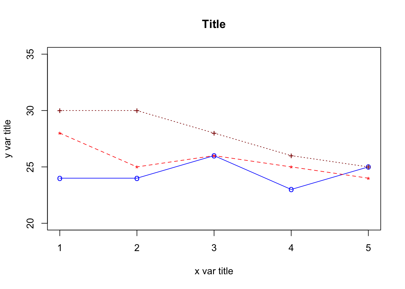
Figure 8: Multi line graph - remove space and add label
Multiple lines graph (with legends) with R
Below is the R script to create a plot with multiple lines and a legend. To do this, create a new script, then paste the script below into RStudio and run the script the same way it was done previously.
Step 1
# define 3 data sets
xtime <- c(1,2,3,4,5) # or simply c(1:5)
y1 <- c(24,24,26,23,25)     # Group 1
y2 <- c(28,25,26,25,24)     # Group 2
y3 <- c(30,30,28,26,25)     # Group 3
Step 2
# plot the first curve by calling plot() function
# First curve is plotted
plot(xtime, y1, type="o", col="blue", pch="o", lty=1, ylim=c(20,40), ylab="y" )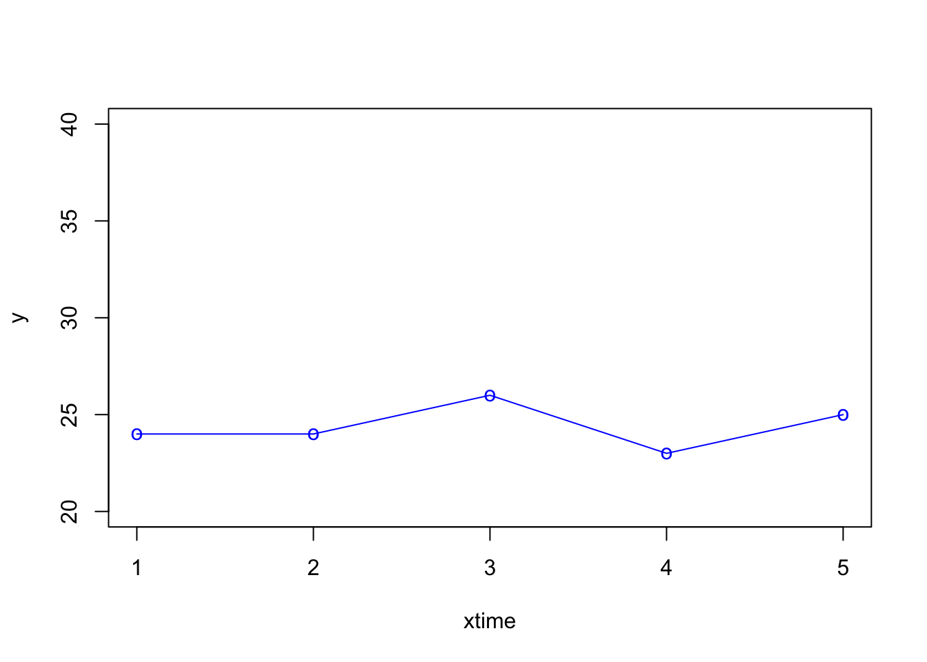
Step 3
# Add second curve to the same plot by calling points() and lines()
# Use symbol '*' for points.
plot(xtime, y1, type="o", col="blue", pch="o", lty=1, ylim=c(20,40), ylab="y" )
points(xtime, y2, col="red", pch="*")
lines(xtime, y2, col="red",lty=2)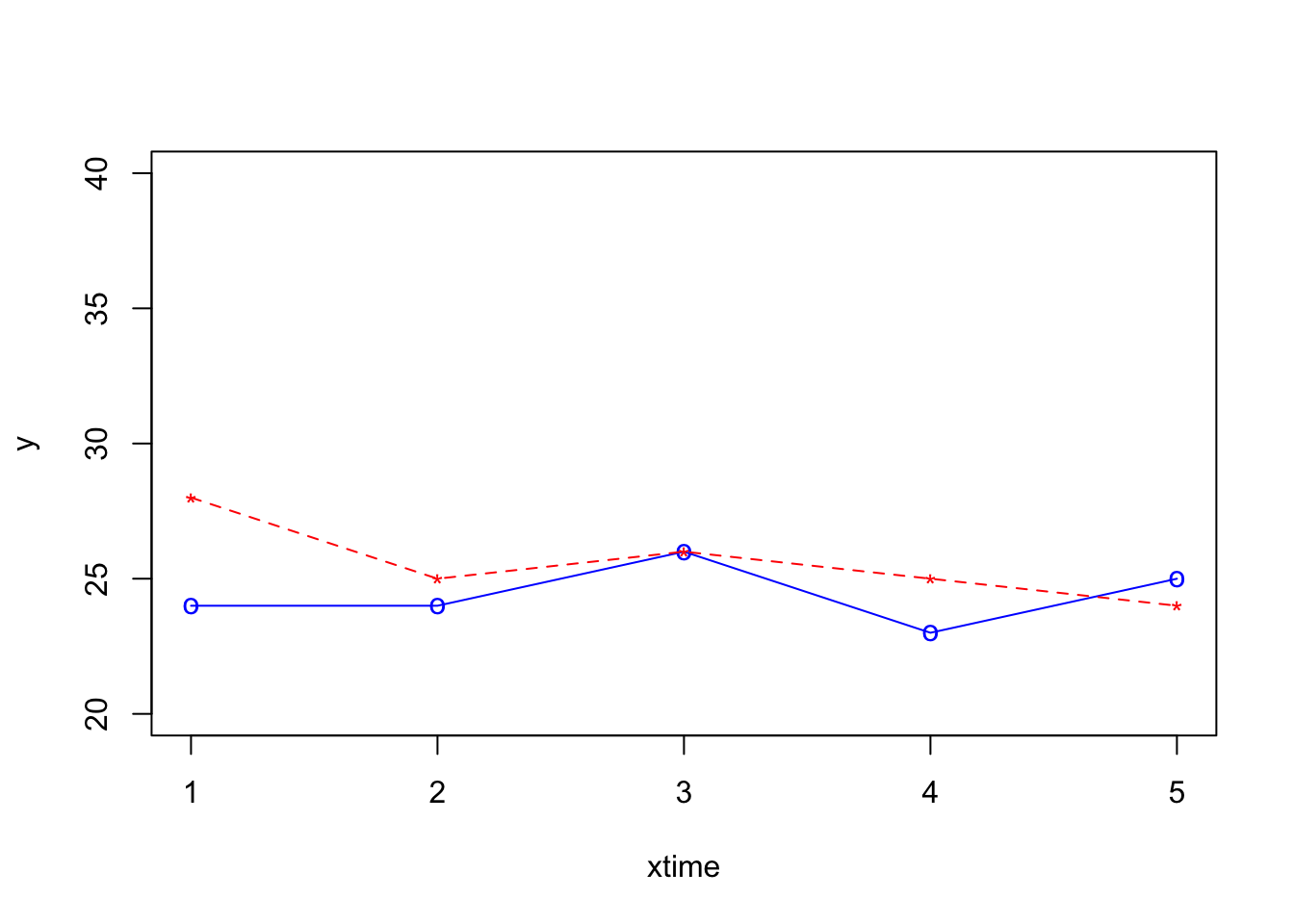
Step 4
# Add Third curve to the same plot by calling points() and lines()
# Use the symbol '+' for points.
plot(xtime, y1, type="o", col="blue", pch="o", lty=1, ylim=c(20,40), ylab="y" )
points(xtime, y2, col="red", pch="*")
lines(xtime, y2, col="red",lty=2)
points(xtime, y3, col="dark red",pch="+")
lines(xtime, y3, col="dark red", lty=3)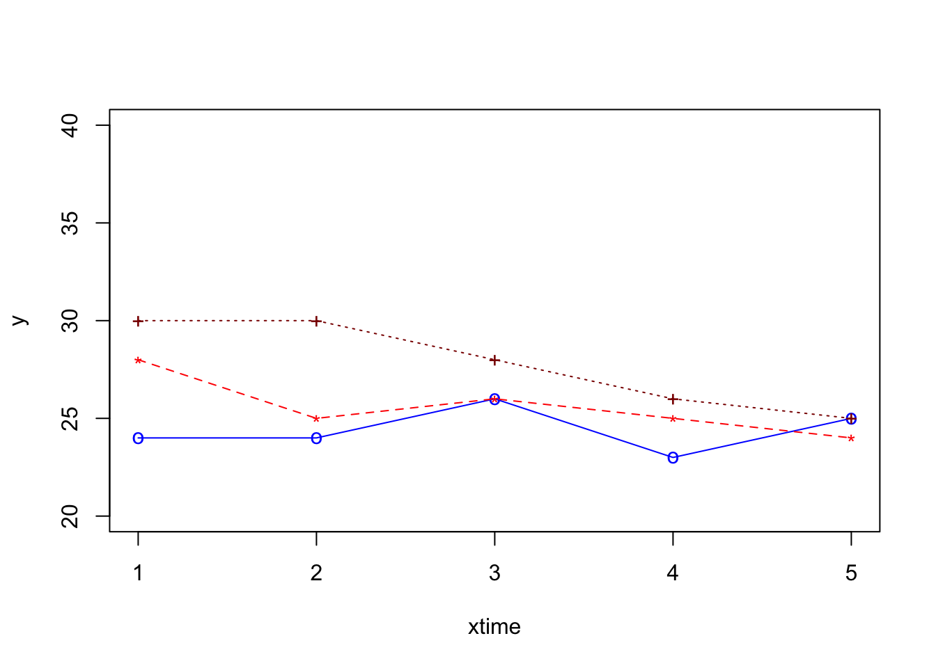
Step 5
# Adding a legend inside the box at the location (1,37) in graph coordinates.
# Note that the order of plots are maintained in the vectors of attributes.
plot(xtime, y1, type="o", col="blue", pch="o", lty=1, ylim=c(20,40), ylab="y" )
points(xtime, y2, col="red", pch="*")
lines(xtime, y2, col="red",lty=2)
points(xtime, y3, col="dark red",pch="+")
lines(xtime, y3, col="dark red", lty=3)
legend(1,37,legend=c("y1","y2","y3"), col=c("blue","red","black"),
       pch=c("o","*","+"),lty=c(1,2,3), ncol=1)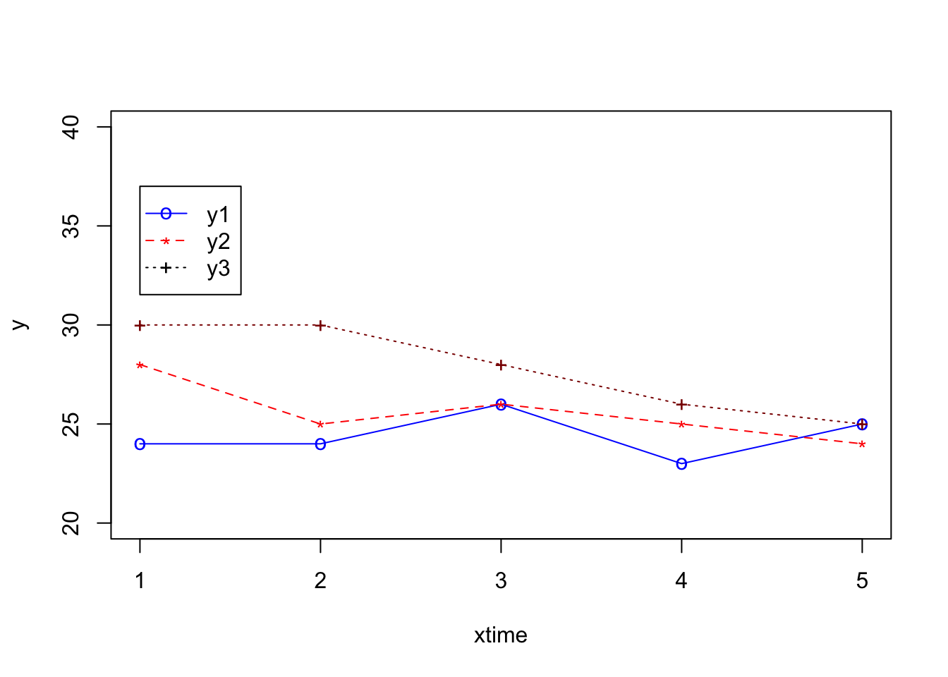
Single line graph with SPSS
GGRAPH
  /GRAPHDATASET NAME="graphdataset" VARIABLES=x MEAN(y)[name="MEAN_y"] MISSING=LISTWISE
    REPORTMISSING=NO
  /GRAPHSPEC SOURCE=INLINE.
BEGIN GPL
  SOURCE: s=userSource(id("graphdataset"))
  DATA: x=col(source(s), name("x"), unit.category())
  DATA: MEAN_y=col(source(s), name("MEAN_y"))
  GUIDE: axis(dim(1), label("x"))
  GUIDE: axis(dim(2), label("Mean y"))
  GUIDE: text.title(label("Single Line Mean of y by x"))
  SCALE: linear(dim(2), include(0))
  ELEMENT: line(position(x*MEAN_y), missing.wings())
END GPL.
This is optional; you can run the script directly in the
Consolepanel in RStudio↩︎